Friday, 26 November 2010
 Here is my contents page. I tried to keep the general color scheme the same (blues and golds) much the same as the Wilmington Grammar School badge. I separated the different page numbers to create a bit of order on the contents page. I added a couple of relevant pictures, however tried to stop from making it look too overcrowded.
Thursday, 25 November 2010
Magazine Titile
I came up with 4 initial ideas which where; HIVE, GAME, BUZZ and WAVE. As you can see by my ideas, i wanted the magazine name to be short and sweet. After carrying out a survey of all the people in my class, i chose to call my magazine WAVE. This could suggest ideas of radio waves, or just the general flow of music, to readers. I think it has very musical idea connected to it. I will be able to make the title bold and bright to catch the attention of the readers.
Friday, 19 November 2010
Magazine Analysis
My magazine is NME (New Musical Express), published by IPC who also publish other magazines such as Loaded, Uncut and Nuts. I believe that the target market for this magazine is teenagers and young adults, as these people have the biggest interest in music. However IPC publish 85 other magazines which reach 27 million UK adults, so the company's target market is very vast. NME magazine currently costs £2.30, it is published once a week and its current circulation is 38,486, a 47% decrease from 2003, where the circulation of the magazine was 72,422. Their sales revenue is currently approximately £350,000 per month.

Friday, 5 November 2010
My Preliminary Task
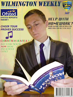
 Here is my magazine cover. As you can see i have added a lot of text, and pictures to the original background. I made the picture brighter, and cleared up the persons face, using the patch tool and the spot healing tool. I cut out the person in the picture and added a new layer. I distorted and pixelated the background slightly, and kept the original picture of the person the same.
Subscribe to:
Comments (Atom)
