Billy Collins' Media
Friday, 28 January 2011
Friday, 7 January 2011
Adjustments


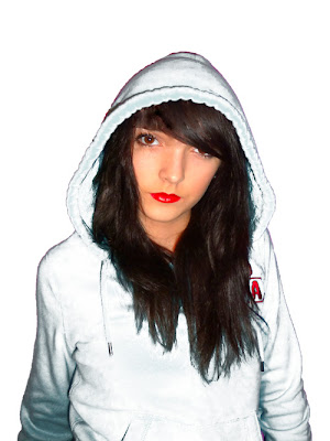
Here you can see all of the adjustments made to the person in the picture. first of all I used the magnetic lasso tool to cut out the person from the background. I then moved this picture into a new document. first of all I touched up on the face, as I talked about in a previous blog. Then I began playing with the colours of the clothes she was wearing, by using the colour replacement tool. I messed around testing different colours and decided that white fit the magazine cover best.
Thursday, 6 January 2011
Face
Here you can see that I have played with the original picture to make it look better. i used the spot healing tool a lot here, to get rid of any spots or blemishes on the persons face. I also used this tool to get rid of the hair covering the persons face. I used the patch too to cover up any gaps in the fringe. I then played with the vibrance and brightness to add colour and glow to the face.


Lips
Friday, 26 November 2010
 Here is my contents page. I tried to keep the general color scheme the same (blues and golds) much the same as the Wilmington Grammar School badge. I separated the different page numbers to create a bit of order on the contents page. I added a couple of relevant pictures, however tried to stop from making it look too overcrowded.
Subscribe to:
Comments (Atom)


